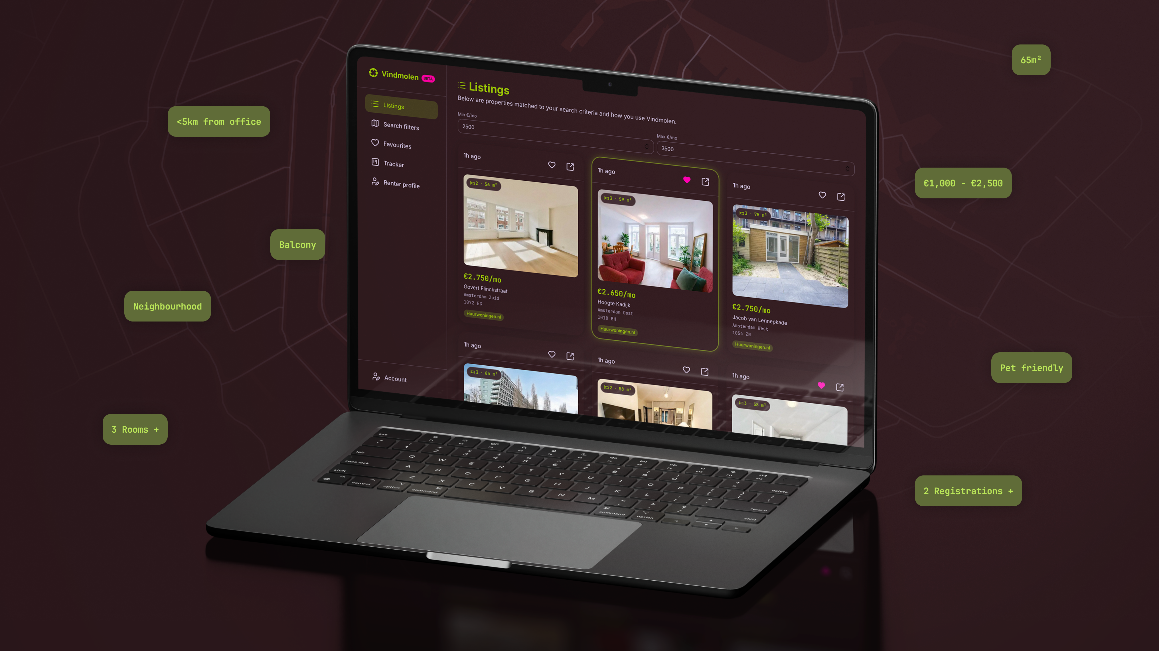
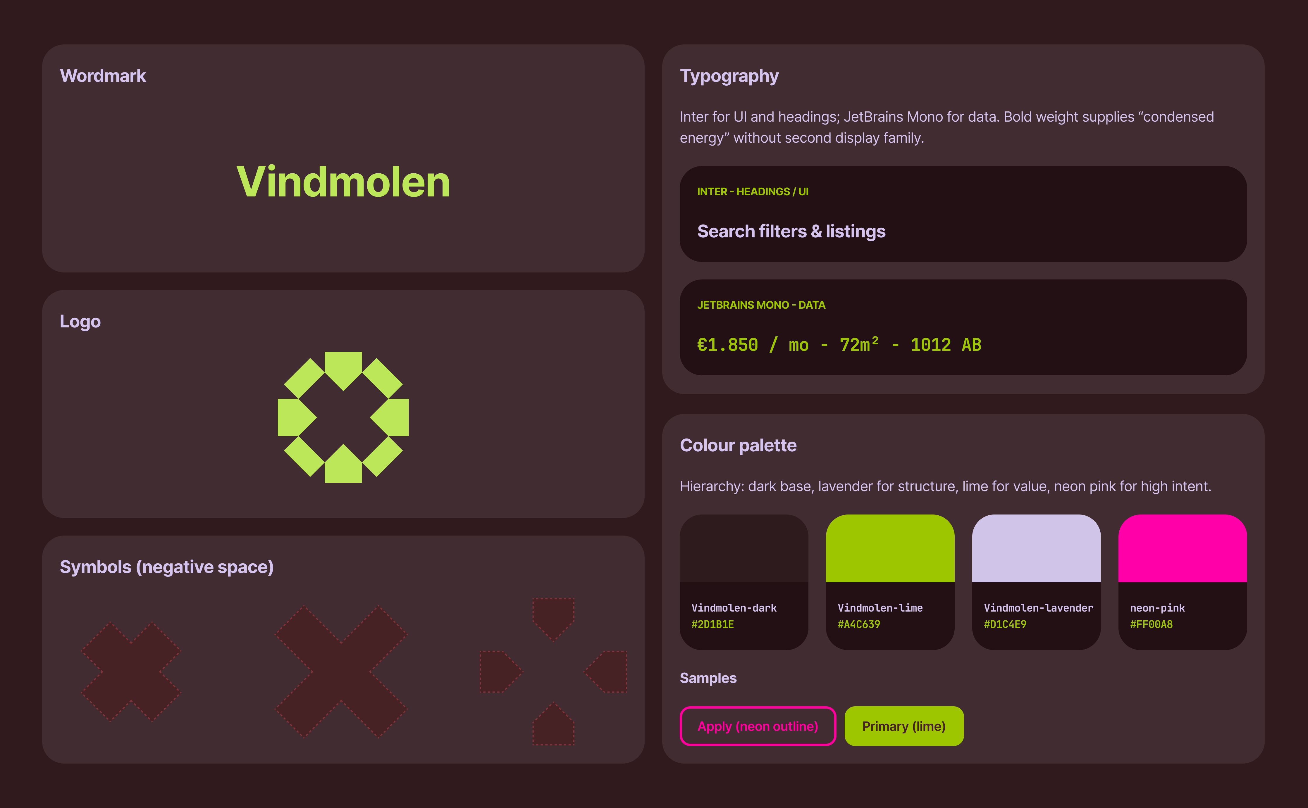
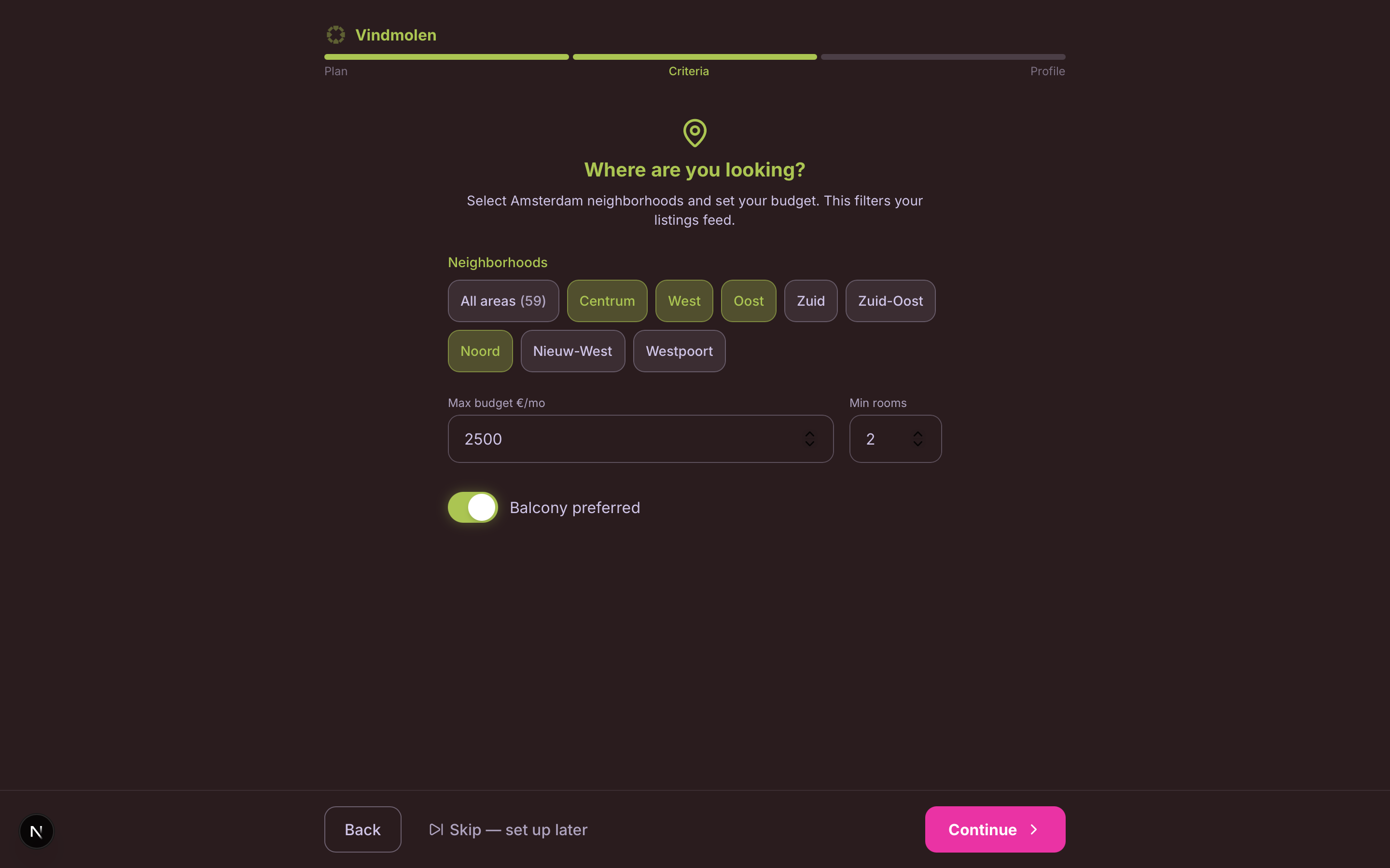
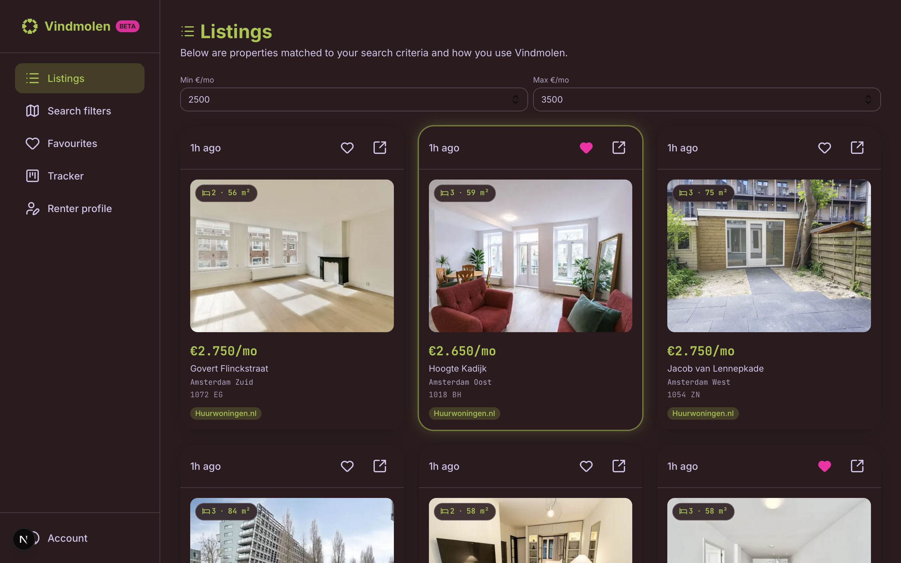
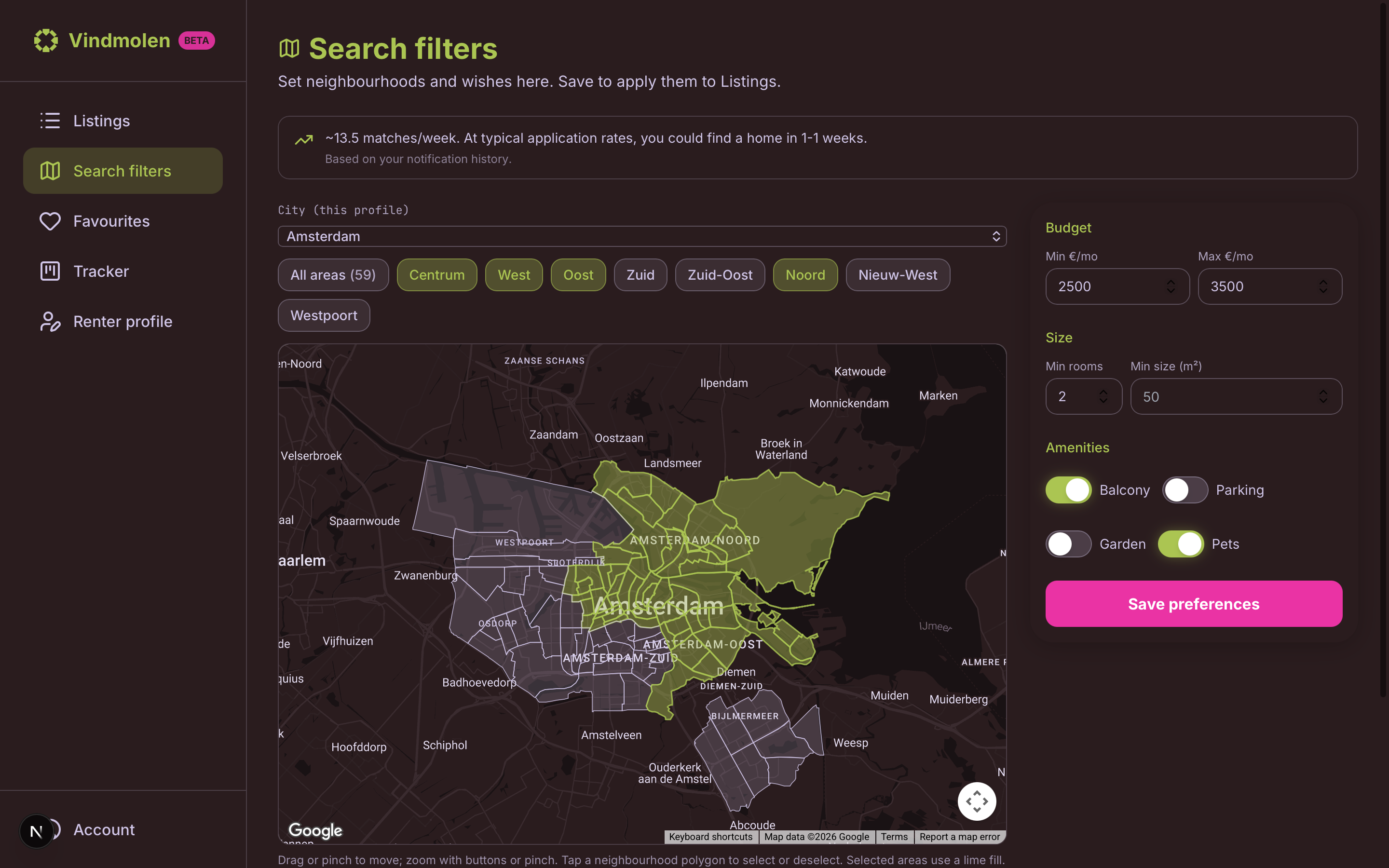
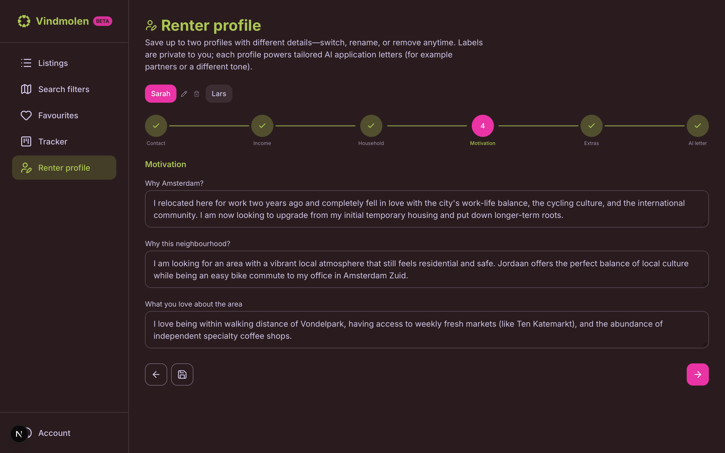
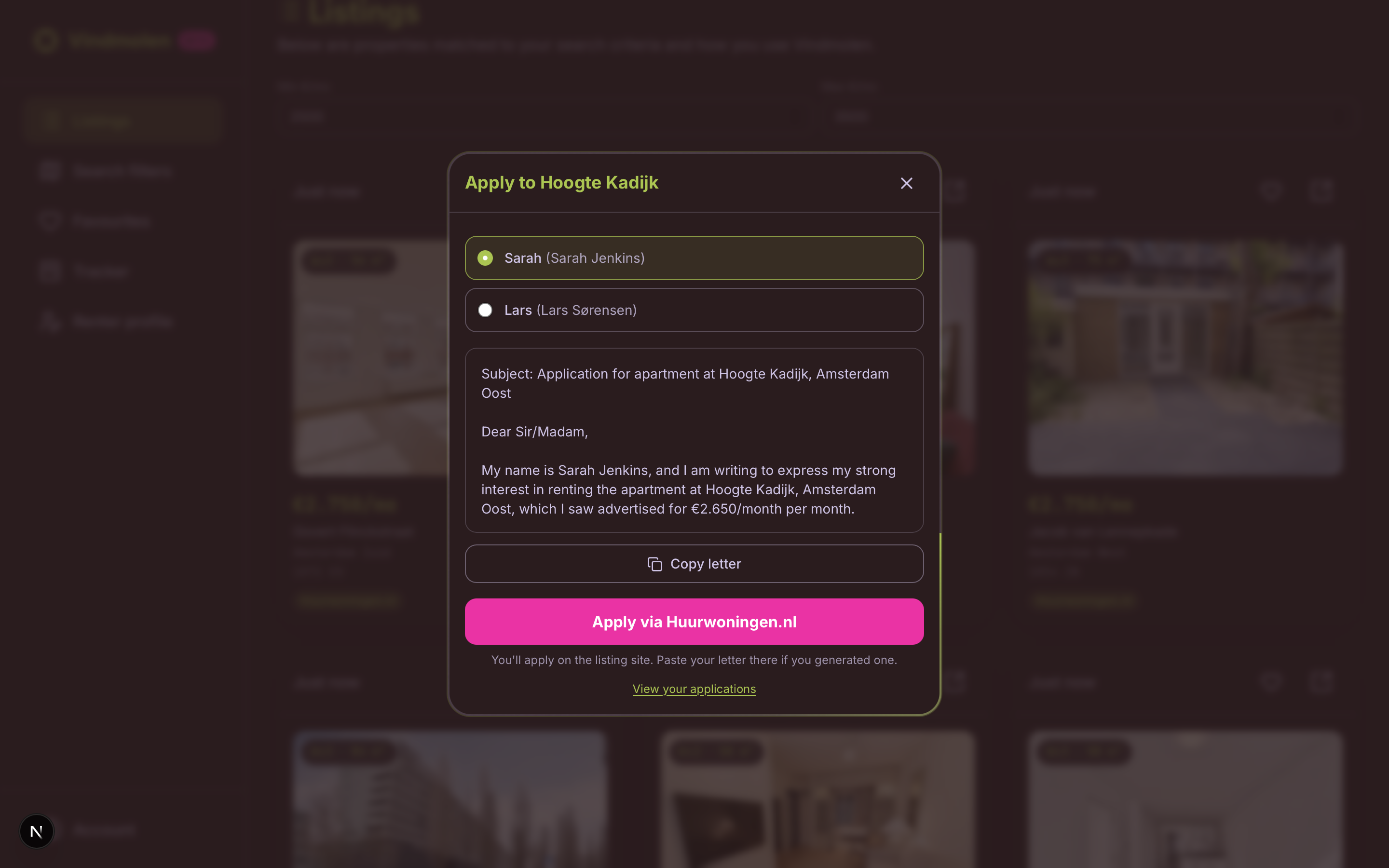
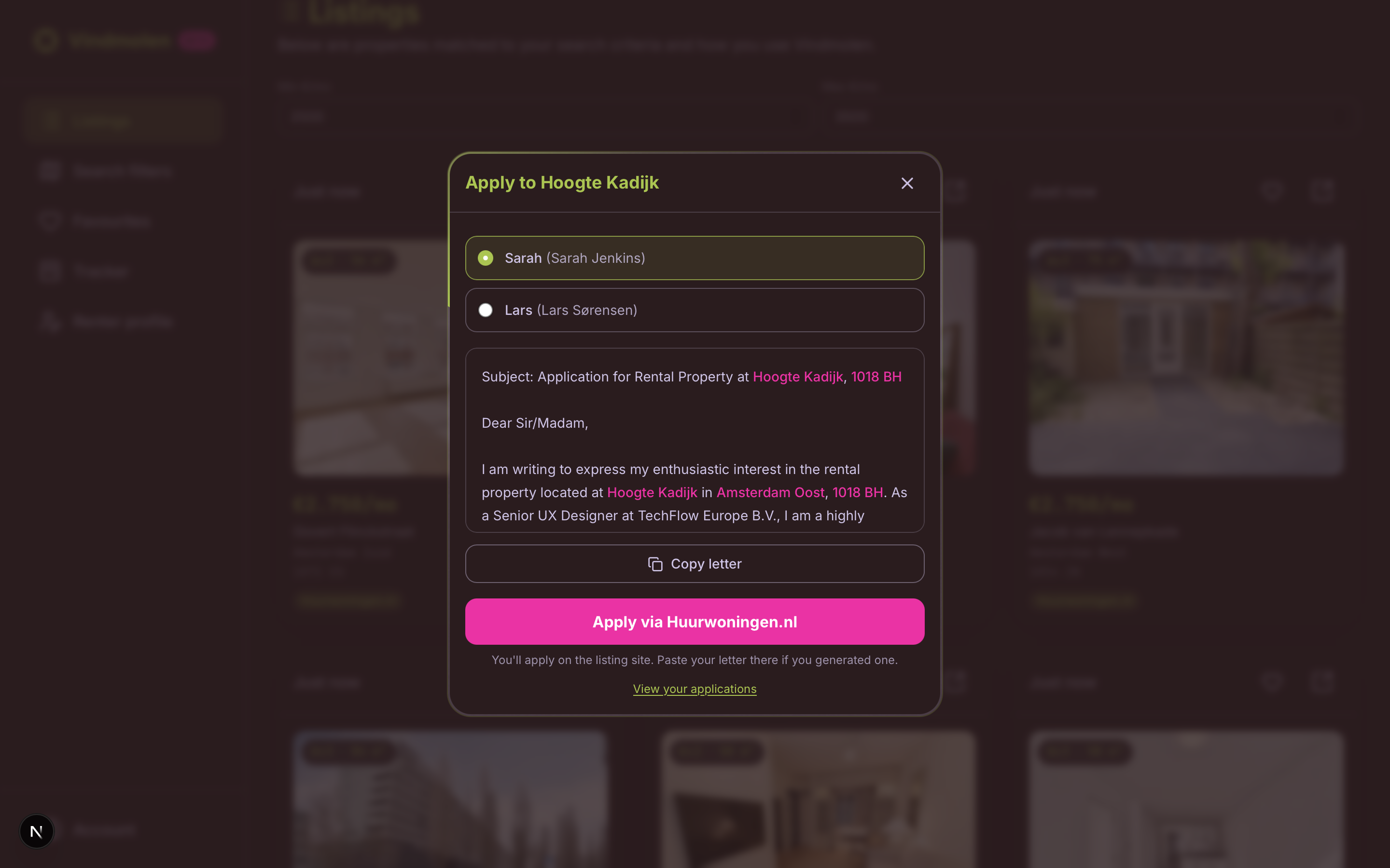
The name Vindmolen combines vind (find) and windmolen (windmill), a Dutch-forward name for a Dutch rental problem. The logo is built around a negative-space X that reads three ways at once: Amsterdam’s city cross, “X marks the spot” for discovery, and the crossed blades of a windmill. House silhouettes frame the symbol so it stays anchored in housing, not abstract tech. Rather than another sterile, blue property site, the interface borrows inspiration from premium fintech dashboards: JetBrains Mono for crisp, data-dense type, and a loud-but-controlled palette of lavender, lime, and neon pink so listings and filters stay scannable under stress. The aim is simple: speed up comprehension and give renters a tool that feels focused and professional.
De naam Vindmolen combineert vind en windmolen, een herkenbare Nederlandse naam voor een echt Nederlands probleem. Het logo is opgebouwd rond een negatieve ruimte X die op drie manieren tegelijk gelezen kan worden: het Amsterdamse stadskruis, “X marks the spot” voor ontdekking, en de gekruiste wieken van een molen. Huissilhouetten omlijsten het symbool zodat het verankerd blijft in de woningmarkt, niet in abstracte tech. In plaats van weer een steriele, blauwe vastgoedsite, leent de interface inspiratie van premium fintech dashboards: JetBrains Mono voor strakke, datarijke typografie, en een gedurfd maar beheerst palet van lavendel, limoen en neonroze zodat aanbod en filters scanbaar blijven onder stress. Het doel is simpel: begrip versnellen en huurders een tool geven die gefocust en professioneel aanvoelt.