♥ UI DESIGN
Tekenomie
A "human-powered" local currency designed to foster community connection and sustainable living in BoTu, Rotterdam. The app concept empowers a diverse neighbourhood to keep economic value local.
Een "mensgedreven" lokale munteenheid ontworpen om gemeenschapsverbinding en duurzaam leven in BoTu, Rotterdam te stimuleren. Het app-concept stelt een diverse buurt in staat om economische waarde lokaal te houden.
- RoleRol
- UI Designer, Brand DesignerUI Designer, Brand Designer
- TimelineTijdslijn
- 6 weeks6 weken
- TeamTeam
- Aartee Shingan, Cristiana Stefanescu, Nathan Stuger
- YearJaar
- 2024
02
The Problem & The UserHet Probleem & De Gebruiker
The ChallengeDe Uitdaging
BoTu (Bospolder-Tussendijken) is one of Rotterdam's most socio-economically disadvantaged neighbourhoods. The Huis van de Toekomst initiative challenged us to develop a "human-powered" solution that could bridge cultural diversity and economic empowerment, keeping value within the community rather than letting it flow outward.
BoTu (Bospolder-Tussendijken) is een van de sociaal-economisch meest kwetsbare wijken van Rotterdam. Het initiatief Huis van de Toekomst daagde ons uit om een "mensgedreven" oplossing te ontwikkelen die culturele diversiteit en economische empowerment kon overbruggen, waarbij waarde binnen de gemeenschap blijft in plaats van weg te vloeien.
The UserDe Gebruiker
BoTu residents include a diverse mix of cultures and digital literacy levels. They share a strong sense of local pride, despite living in multiple distinct separate communities.
Bewoners van BoTu zijn een diverse mix van culturen en niveaus van digitale geletterdheid. Ze delen een sterk gevoel van lokale trots, ondanks dat ze in meerdere afzonderlijke gemeenschappen leven.
21%
of BoTu household incomes are below Rotterdam city average.
van de huishoudinkomens in BoTu ligt onder het Rotterdamse gemiddelde.
14,000+
Residents, yet research shows that informal bartering networks remain siloed.
Inwoners, maar onderzoek toont aan dat informele ruilnetwerken gescheiden blijven.
15%
of the Dutch population struggling with complex digital services.
van de Nederlandse bevolking heeft moeite met complexe digitale diensten.
03
The Approach & ProcessDe Aanpak & Het Proces
Research & DiscoveryOnderzoek & Ontdekking
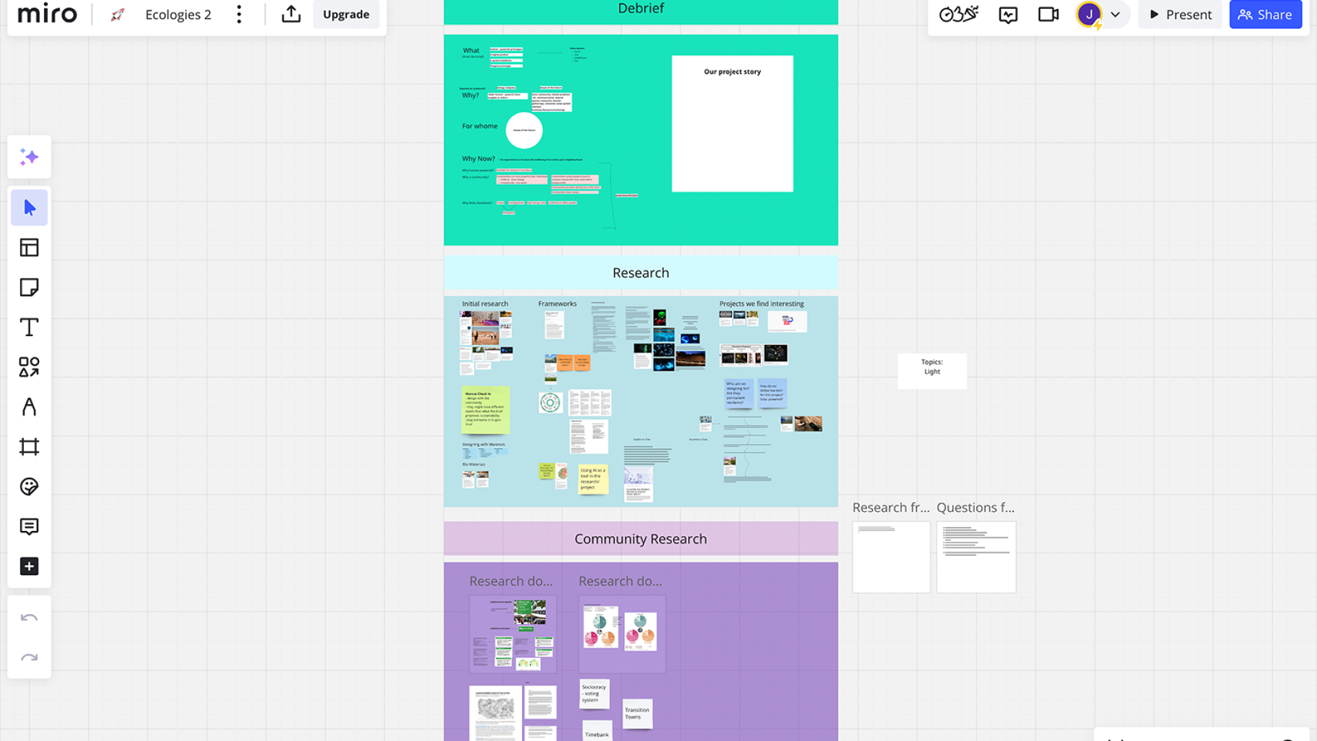
Intensive ideation workshops helped us define "human-powered". We then conducted field research and resident interviews in BoTu, which revealed a strong preference for a mobile-first solution. Inspired by giving the community something they can own and control, we explored transition towns and discovered the concept of local digital currencies as a vehicle for community-driven economics.
Intensieve ideatieworkshops hielpen ons om "mensgedreven" te definiëren. Vervolgens voerden we veldonderzoek en interviews met bewoners uit in BoTu, wat een sterke voorkeur voor een mobiele oplossing aan het licht bracht. Geïnspireerd door de gemeenschap iets te geven dat ze zelf kunnen bezitten en beheren, verkenden we 'transition towns' en ontdekten we het concept van lokale digitale valuta als middel voor gemeenschapsgedreven economie.
Ideation & WireframingIdeatie & Wireframing
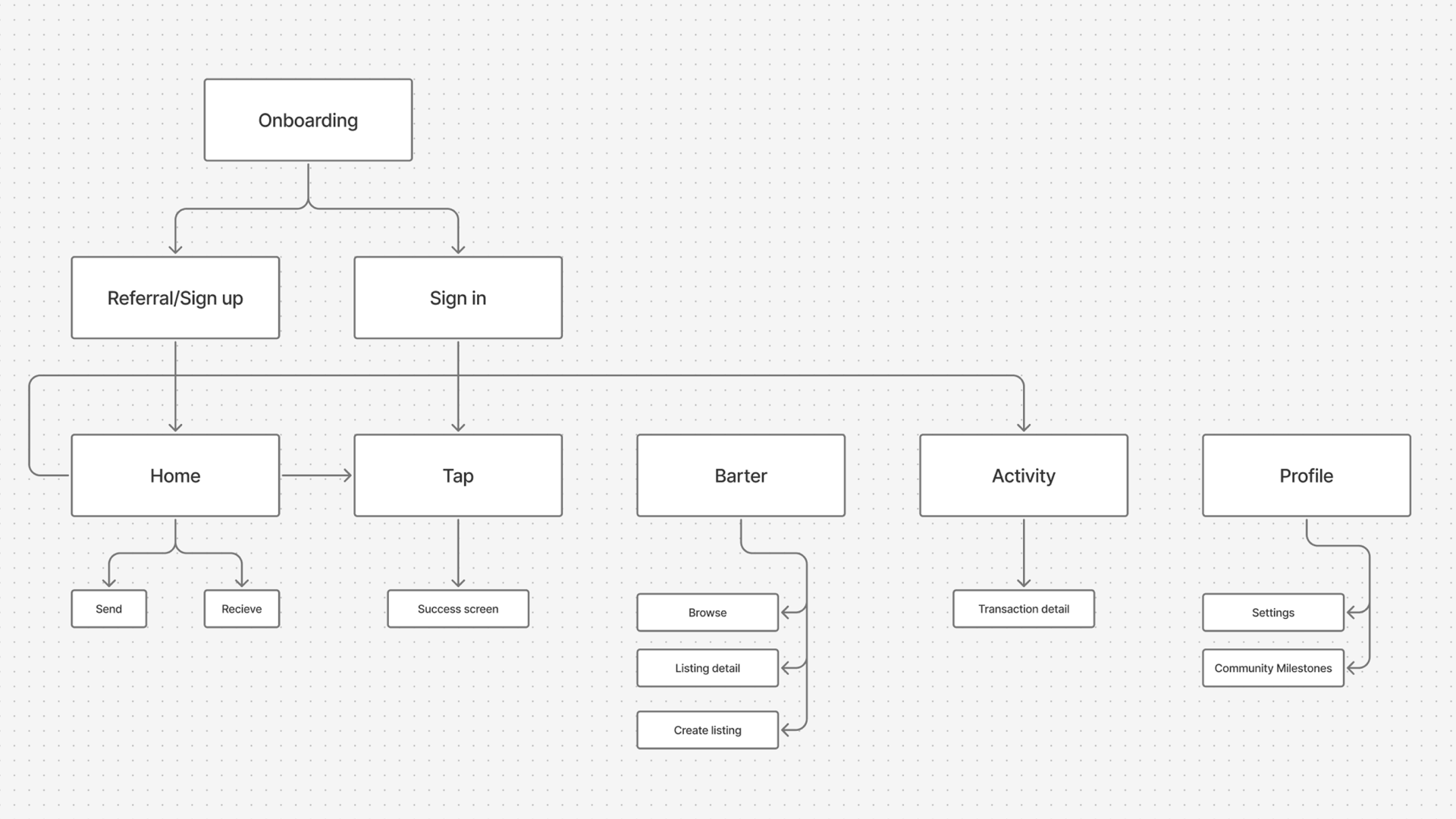
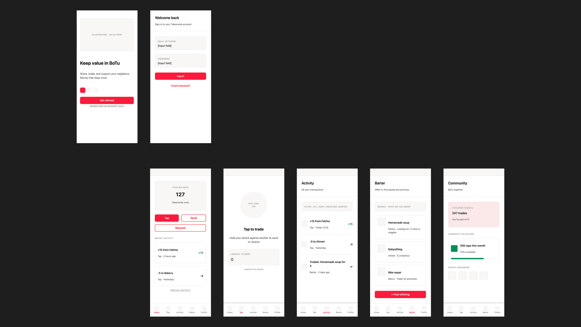
We developed a simple sitemap so we could focus on delivering an MVP and testing it quickly. To enable testing, we also produced some Low-fidelity wireframes for some of our key user journeys, keeping the interface straightforward, geared to all ages & levels of digital literacy.
We ontwikkelden een eenvoudige sitemap zodat we ons konden concentreren op het leveren van een MVP en dit snel konden testen. Om testen mogelijk te maken, produceerden we ook enkele Low-fidelity wireframes voor onze belangrijkste gebruikersstromen, waarbij we de interface rechttoe rechtaan hielden, gericht op alle leeftijden en niveaus van digitale vaardigheid.
Prototyping & User TestingPrototyping & Gebruikerstesten
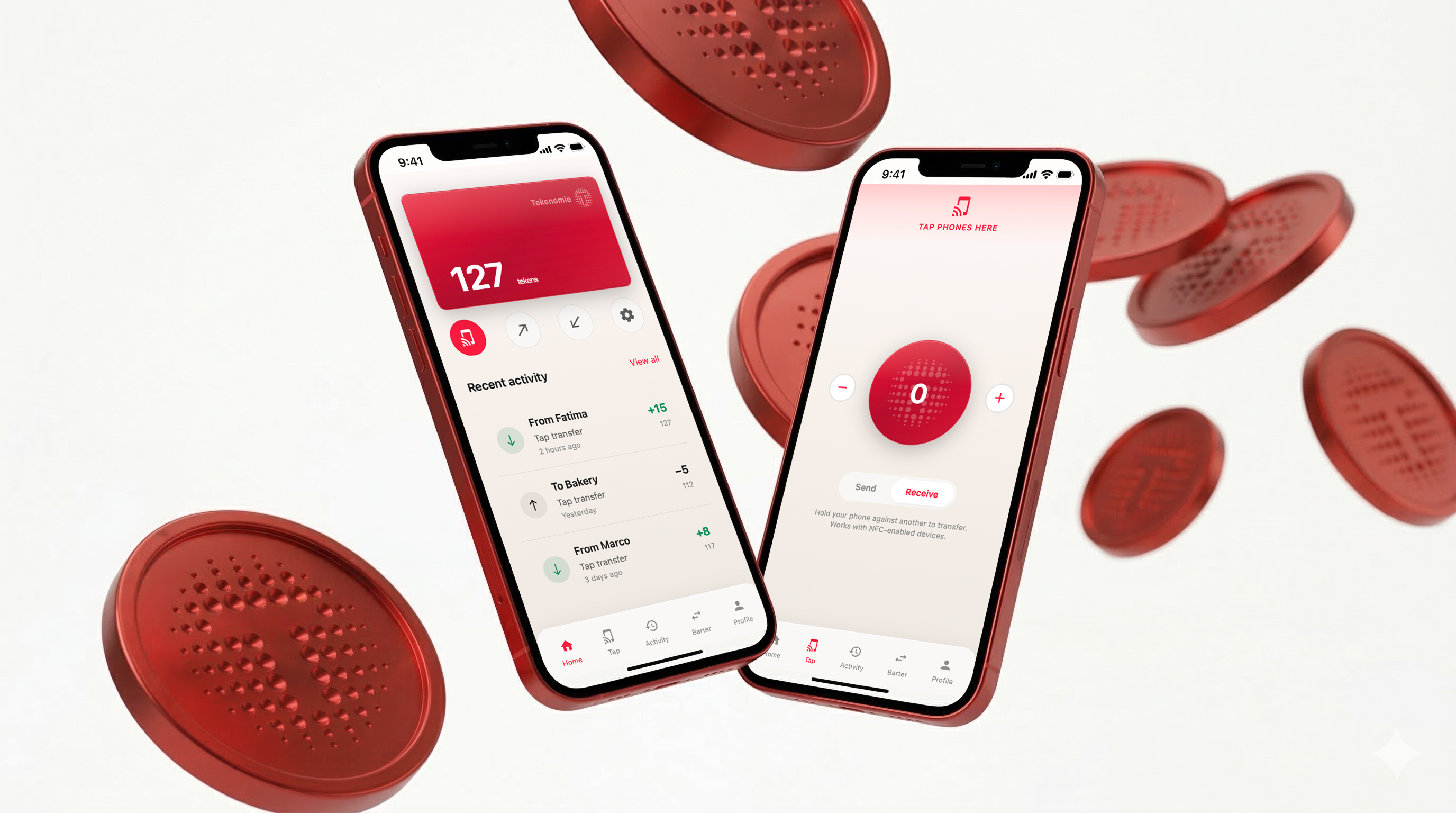
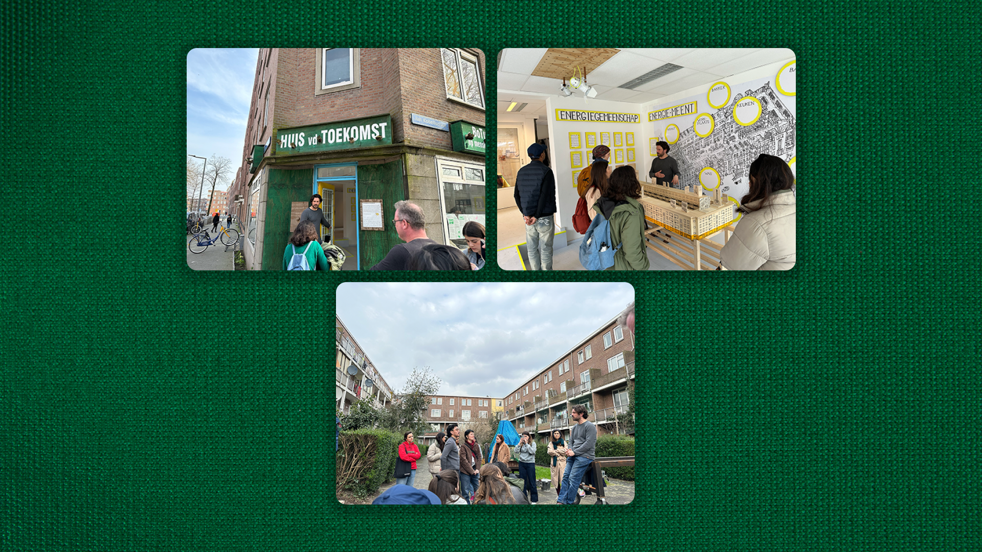
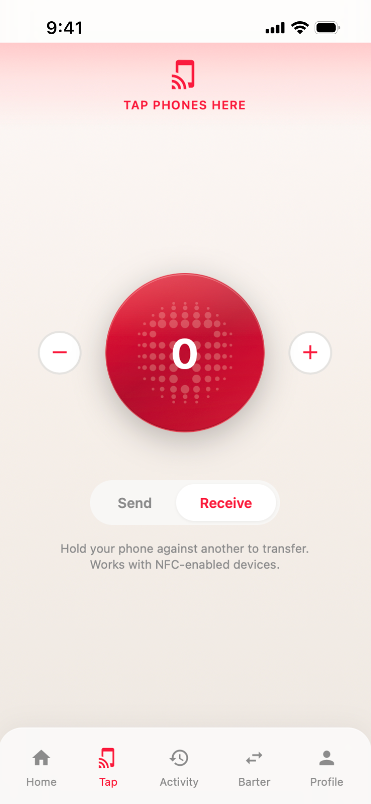
We took prototypes directly to BoTu residents for in-context testing, gathering feedback to refine accessibility and usability. Our feedback focused on making NFC-based transactions feel as intuitive as handing over physical cash, and protecting the community through invite only access.
We namen prototypes direct mee naar de bewoners van BoTu voor testen in hun eigen omgeving, waarbij we feedback verzamelden om toegankelijkheid en bruikbaarheid te verfijnen. Onze feedback richtte zich op het maken van NFC-gebaseerde transacties die net zo intuïtief aanvoelen als het overhandigen van contant geld, en het beschermen van de gemeenschap via toegang op uitnodiging.
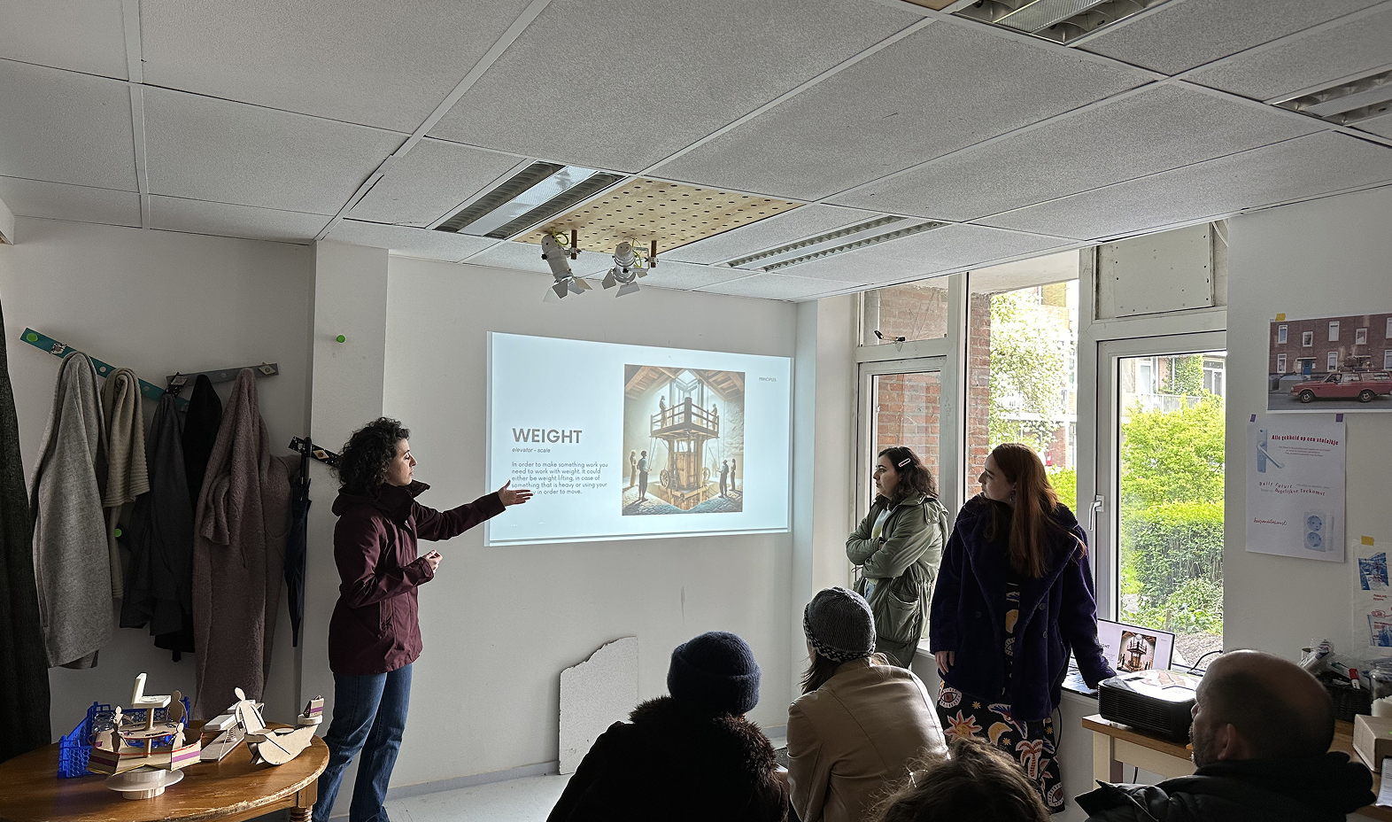
Our peers presenting to BoTu residents on feedback day
Onze peers presenteren aan bewoners van BoTu op de feedbackdag
04
The SolutionDe Oplossing
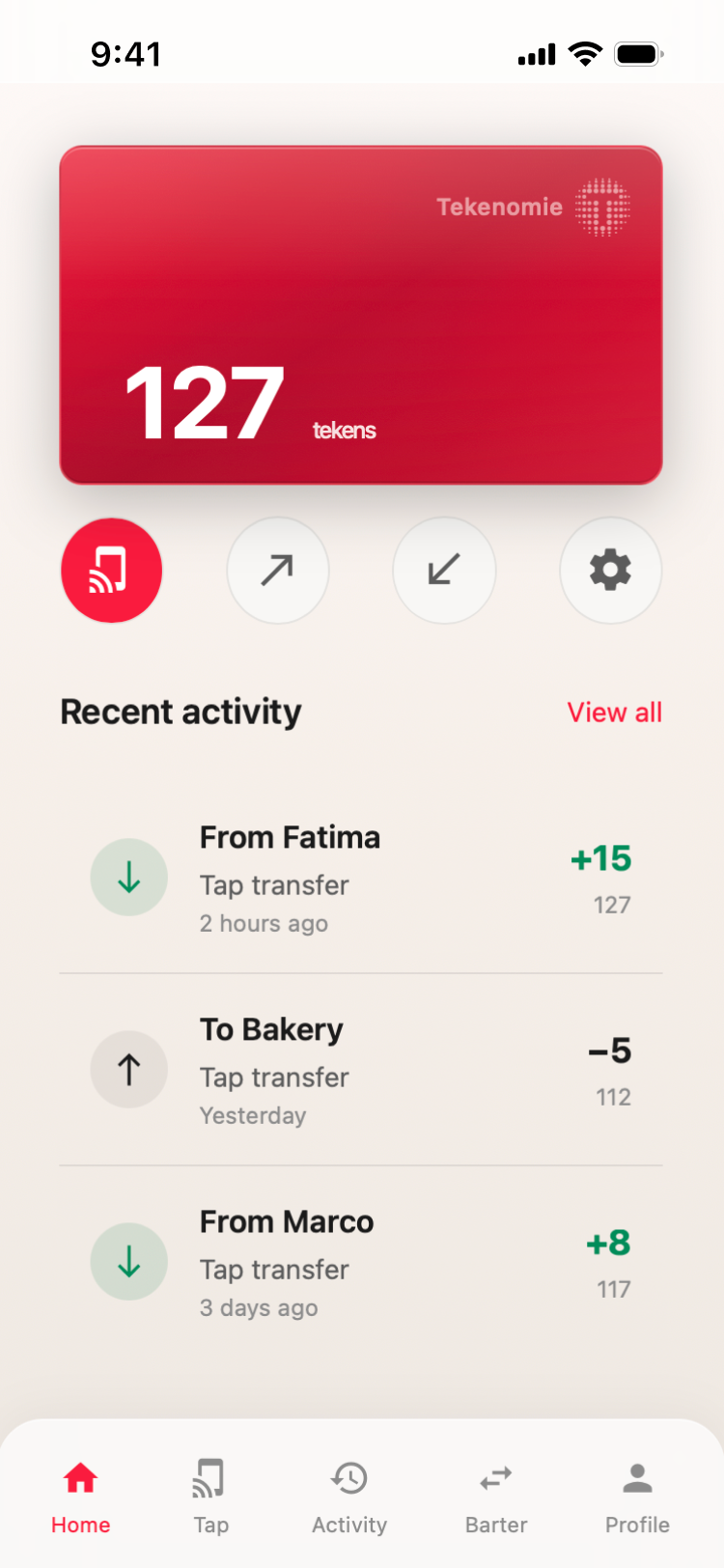
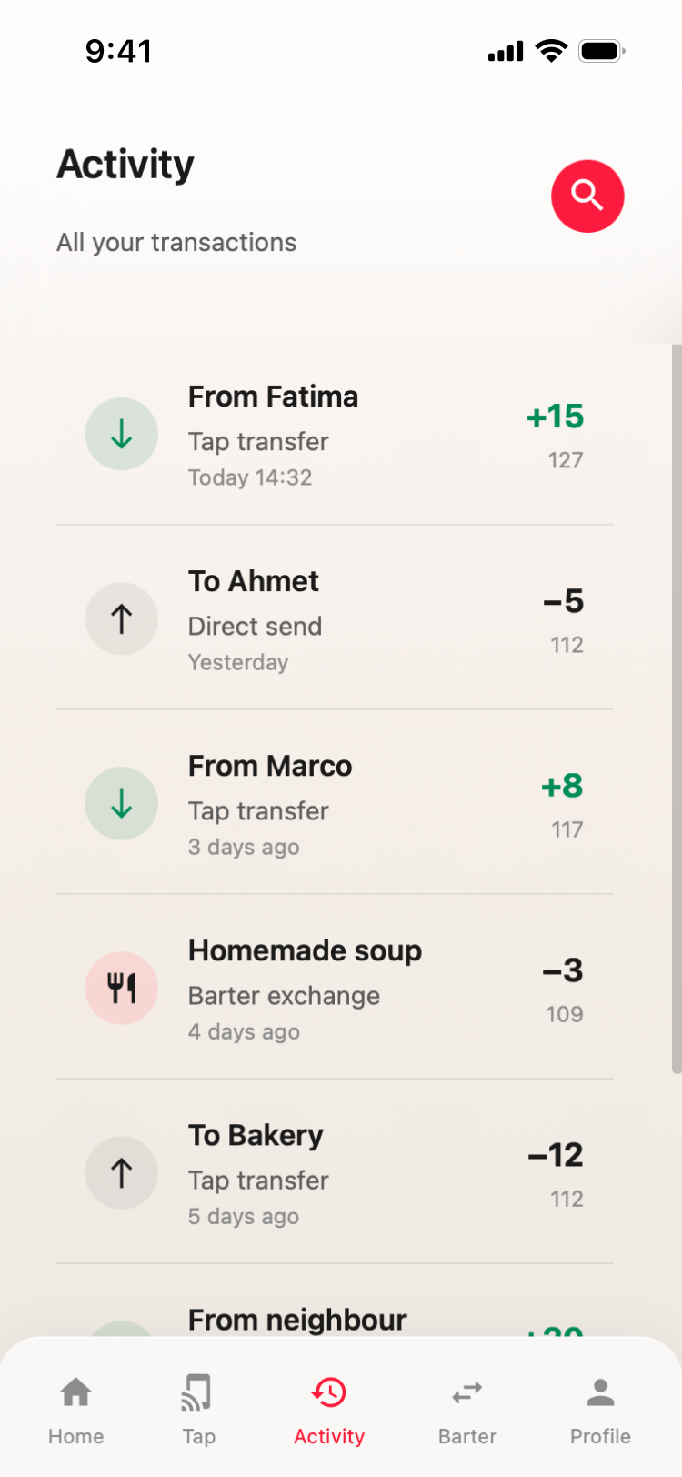
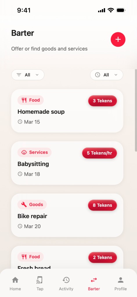
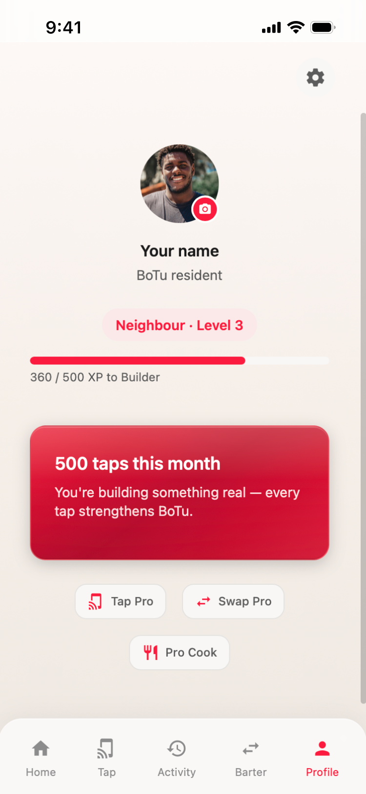
The app goes beyond simple transactions. It turns everyday chores into an act of community participation.
De app gaat verder dan simpele transacties. Het verandert alledaagse klusjes in een daad van gemeenschapsparticipatie.
05
Brand GuidelinesMerkrichtlijnen
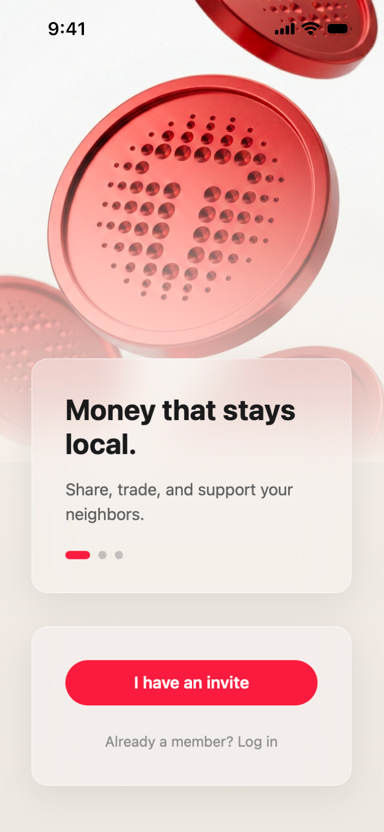
To reflect BoTu's diverse makeup, the brand identity was crafted to evoke a true sense of belonging. By adopting a primary red shared by the Turkish, Surinamese, and Moroccan flags, the design system pays homage to the neighbourhood's largest communities. This theme of connection is echoed in the logo: individual circles forming a unified ring, representing distinct cultures coming together to build a resilient local economy.
Om de diverse samenstelling van BoTu te weerspiegelen, werd de merkidentiteit ontworpen om een echt gevoel van saamhorigheid op te roepen. Door een primair rood te kiezen dat gedeeld wordt door de Turkse, Surinaamse en Marokkaanse vlaggen, brengt het ontwerpsysteem een eerbetoon aan de grootste gemeenschappen in de buurt. Dit thema van verbinding wordt weerspiegeld in het logo: individuele cirkels die een verenigde ring vormen, wat de verschillende culturen vertegenwoordigt die samenkomen om een veerkrachtige lokale economie op te bouwen.
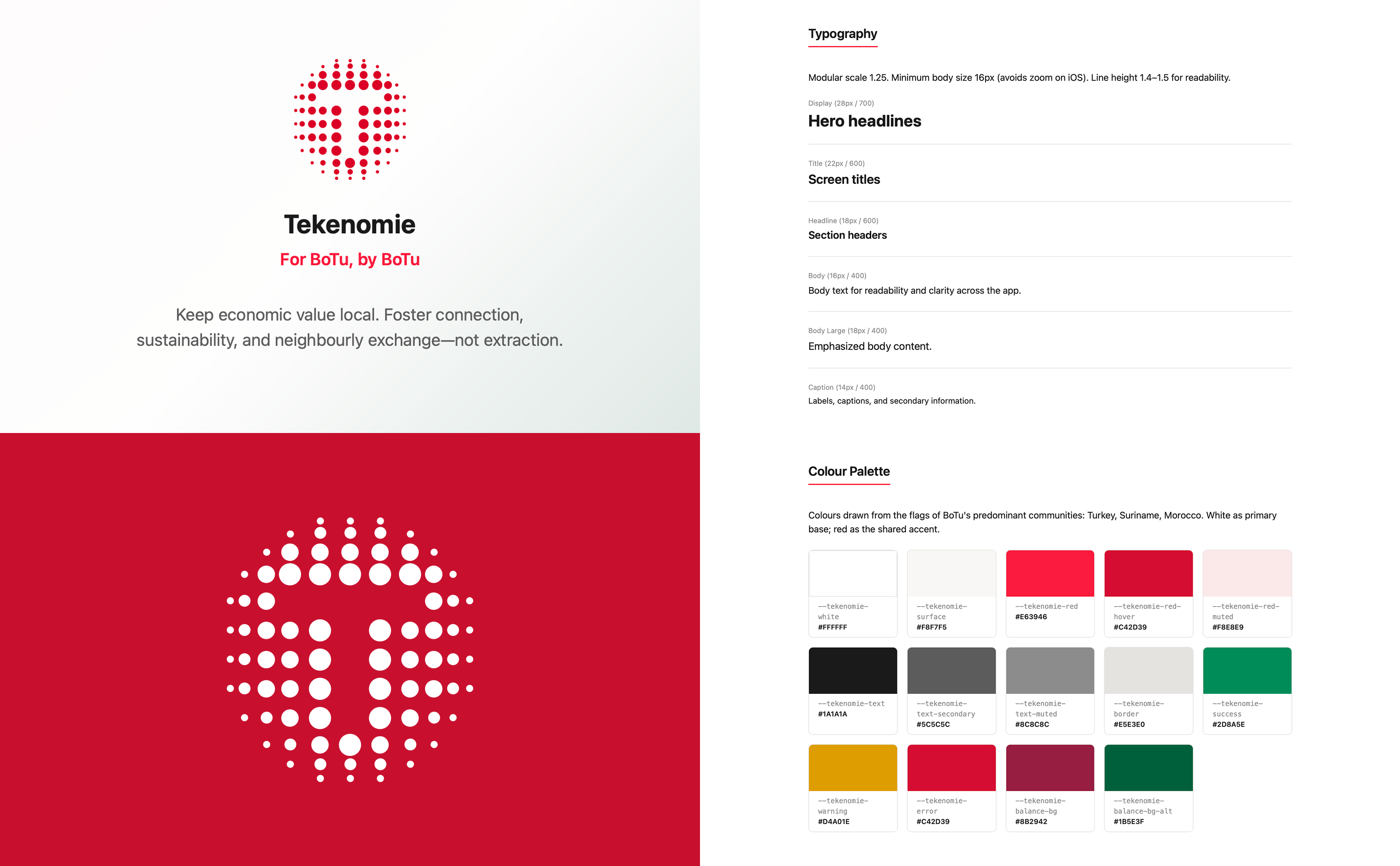
Brand guidelines — logo, typography, and colour palette
Merkrichtlijnen — logo, typografie en kleurenpalet
06
The ImpactDe Impact
More than a payment tool, Tekenomie fosters resource sharing, strengthens local connections, and adopts a more communal way of living inspired by transition towns.
Meer dan een betaalmiddel, stimuleert Tekenomie het delen van middelen, versterkt het lokale verbindingen en omarmt het een meer gemeenschappelijke manier van leven geïnspireerd door transition towns.
🏆
Community Choice Award (Huis van de Toekomst jury)
Community Choice Award (Huis van de Toekomst jury)
75%
of residents felt that the NFC transfer felt as intuitive as cash
van de bewoners vond dat de NFC-overdracht net zo intuïtief aanvoelde als contant geld
100%
Owned and operated by BoTu
Eigendom van en beheerd door BoTu
07
Reflection & LearningsReflectie & Geleerde lessen
What I LearnedWat ik heb geleerd
Designing for financial services in a socio-economically diverse context is not a one-size fits all approach. Building a brand that resonates with multiple communities simultaneously requires listening, observation and a willingness to let the community's story shape the design.
Ontwerpen voor financiële diensten in een sociaal-economisch diverse context is geen 'one-size-fits-all' benadering. Het bouwen van een merk dat bij meerdere gemeenschappen tegelijkertijd resoneert, vereist luisteren, observeren en de bereidheid om het verhaal van de gemeenschap het ontwerp te laten vormen.
What I'd Do DifferentlyWat ik anders zou doen
If starting again, I would invest more time in co-design sessions directly with BoTu residents, not just for user testing, but for ideation. I would also explore the technical feasibility of NFC integration earlier in the process to ensure the "tap to trade" vision could be fully realised within the project timeline.
Als ik opnieuw zou beginnen, zou ik meer tijd investeren in co-design sessies direct met de bewoners van BoTu, niet alleen voor gebruikerstesten, maar ook voor ideatie. Ik zou ook de technische haalbaarheid van NFC-integratie eerder in het proces verkennen om te zorgen dat de visie van "tikken om te ruilen" volledig gerealiseerd kon worden binnen de tijdslijn van het project.