To the younger generation, insurance can seem inaccessible. We set out to revitalise Stubben Edge's direct-to-consumer products by developing a new brand and website to make financial services digestible and approachable for a new audience.
Voor de jongere generatie kunnen verzekeringen ontoegankelijk lijken. We wilden de direct-to-consumer-producten van Stubben Edge nieuw leven inblazen door een nieuw merk en een website te ontwikkelen om financiële diensten begrijpelijk en benaderbaar te maken voor een nieuw publiek.
RoleRol
Brand Designer, UX Designer, Web Designer (Startups, am I right?)Brand Designer, UX Designer, Web Designer (Startups, hè?)
TimelineTijdslijn
6 Months6 maanden
TeamTeam
Lucy Wayment, Tayla Bresser, Bruno Mameli
YearJaar
2023
02
The Problem & The UserHet Probleem & De Gebruiker
The ProblemHet Probleem
Financial services, insurance in particular, is just not that sexy. To a generation facing a high cost of living, insurance can feel like an expensive obligation rather than a genuine safety net. The industry's reliance on complex T&Cs doesn't just make the product dull; it sows mistrust, making a service designed to offer peace of mind feel like a trap. Yet, the need for financial protection remains.
Financiële diensten, en verzekeringen in het bijzonder, zijn gewoon niet erg sexy. Voor een generatie die te maken heeft met hoge kosten van levensonderhoud, kunnen verzekeringen aanvoelen als een dure verplichting in plaats van een echt vangnet. De afhankelijkheid van de sector van complexe algemene voorwaarden maakt het product niet alleen saai; het zaait wantrouwen, waardoor een dienst die bedoeld is om gemoedsrust te bieden, aanvoelt als een valstrik. Toch blijft de behoefte aan financiële bescherming bestaan.
The UserDe Gebruiker
Gen Z are growing up navigating a stressful financial landscape. They are turning to unconventional channels like TikTok, Reddit, and "finfluencers" because traditional institutions feel inaccessible and out of touch. While they are eager to build financial literacy, they are simultaneously overwhelmed by noise and conflicting information online. They demand transparency and frictionless digital experiences.
Gen Z groeit op in een stressvol financieel landschap. Ze wenden zich tot onconventionele kanalen zoals TikTok, Reddit en "finfluencers" omdat traditionele instellingen ontoegankelijk en wereldvreemd aanvoelen. Hoewel ze graag financiële geletterdheid willen opbouwen, worden ze tegelijkertijd overweldigd door ruis en tegenstrijdige informatie online. Ze eisen transparantie en wrijvingsloze digitale ervaringen.
25%
of young adults avoid insurance due to jargon
van de jongvolwassenen vermijdt verzekeringen vanwege vaktaal (jargon)
14s
average time spent on product pages
gemiddelde tijd besteed op productpagina's
79%
of young adults turn to social media for financial advice
van de jongvolwassenen wendt zich tot sociale media voor financieel advies
03
The Approach & ProcessDe Aanpak & Het Proces
Market ResearchMarktonderzoek
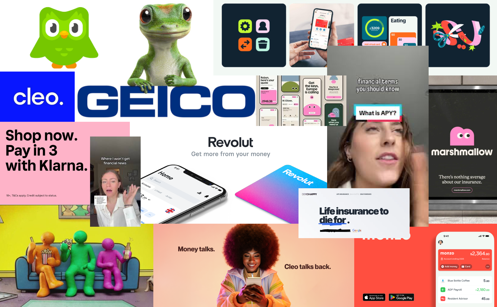
Building trust with younger consumers means translating dense, FCA-compliant information into a format they actually want to read. We discovered that the antidote to insurance fatigue is a blend of informal advice, distinct mascot branding, and ultra-clear navigation. Drawing inspiration from Marshmallow's cognitive-load-reducing UI (one question per page) and Cleo's radically transparent tone of voice, our solution strips away the corporate sludge to ensure users fully understand their coverage.
Vertrouwen opbouwen bij jongere consumenten betekent het vertalen van dichte, aan regelgeving (FCA) volgende informatie naar een format dat ze daadwerkelijk willen lezen. We ontdekten dat het tegengif voor verzekeringsmoeheid een mix is van informeel advies, onderscheidende mascotte-branding en ultra-heldere navigatie. Geïnspireerd door de cognitieve-belasting-verlagende UI van Marshmallow (één vraag per pagina) en de radicaal transparante tone-of-voice van Cleo, stript onze oplossing de zakelijke modder weg om te zorgen dat gebruikers hun dekking volledig begrijpen.
Moodboard & market analysis to help us carve our own brand
Moodboard & marktanalyse om ons te helpen onze eigen merkidentiteit te bepalen
Brand DevelopmentMerkontwikkeling
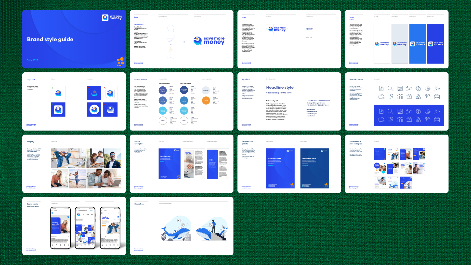
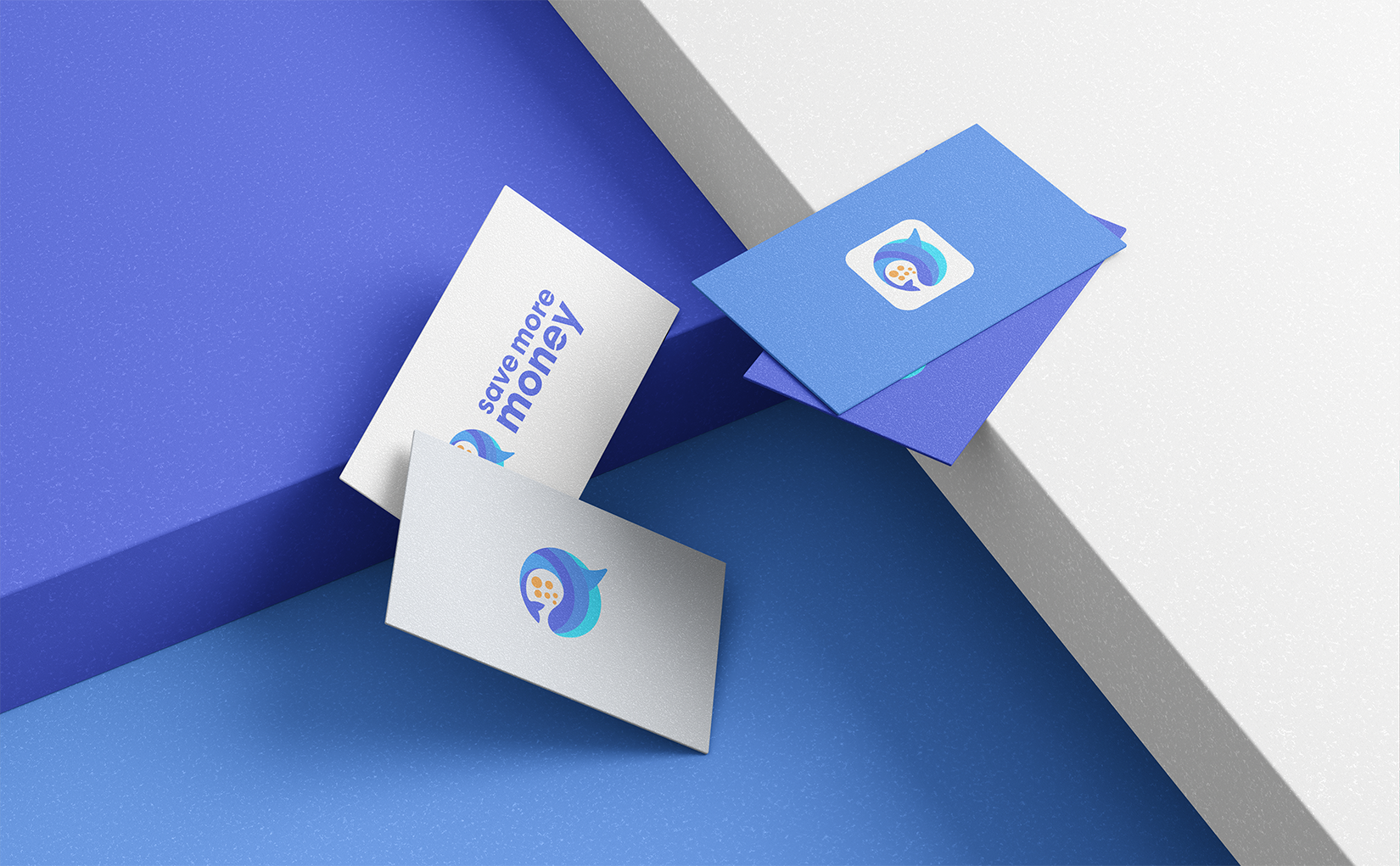
Our brand ideation focused heavily on symbolism. We developed a logo blending a speech bubble (informal advice) with a whale (wealth) and coin-shaped spray (financial growth). For the digital experience, I started by wireframing and prototyping the site in Figma to ensure a minimal layout that guided users naturally.
Onze merkideatie richtte zich sterk op symboliek. We ontwikkelden een logo dat een tekstballon (informeel advies) combineert met een walvis (rijkdom) en muntvormige spray (financiële groei). Voor de digitale ervaring begon ik met het maken van wireframes en prototypes van de site in Figma om een minimale lay-out te garanderen die gebruikers natuurlijk begeleidt.
Savemoremoney Brand Guide
Savemoremoney Merkgids
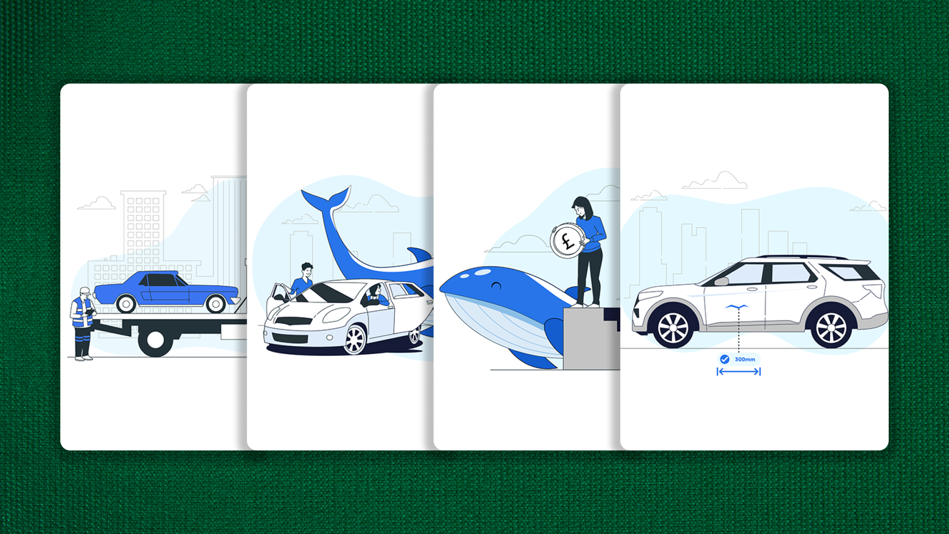
Custom illustrations to explain insurance products in an approachable, on-brand style
Aangepaste illustraties om verzekeringsproducten uit te leggen in een benaderbare, merkeigen stijl
Prototyping & Web DesignPrototyping & Webdesign
Once the Figma prototypes were refined, I brought the designs to life using no-code web development tools. This allowed for rapid testing of interactive elements, like the product carousel and the SEO-optimised blog layout, ensuring the user journey was seamless before launch.
Zodra de Figma-prototypes verfijnd waren, bracht ik de ontwerpen tot leven met no-code webontwikkelingstools. Dit maakte het mogelijk om interactieve elementen snel te testen, zoals de productcarrousel en de SEO-geoptimaliseerde blog-lay-out, zodat de klantreis naadloos was voor de lancering.
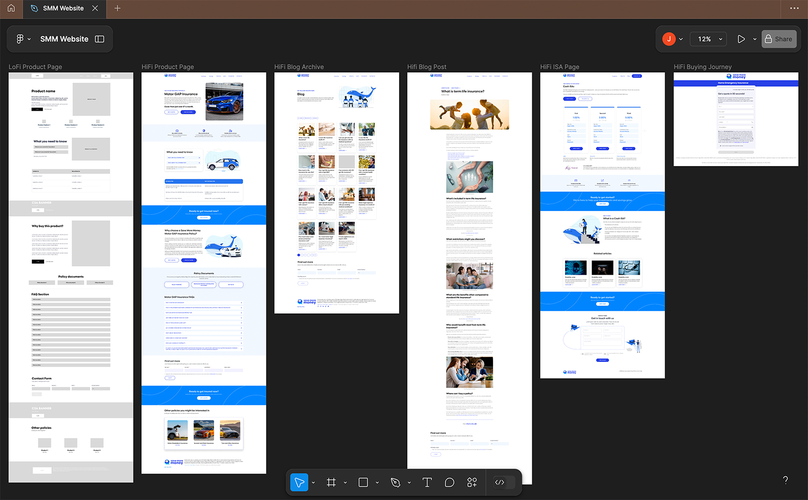
LoFi wireframes iterated into HiFi designs for product pages, blog, and buying journey templates
LoFi wireframes geïtereerd naar HiFi ontwerpen voor productpagina's, blog en koopprocestemplates
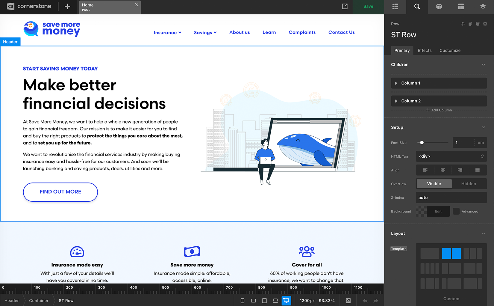
No-code build in Cornerstone, translating Figma prototypes into a live website
No-code bouw in Cornerstone, waarbij Figma-prototypes worden vertaald naar een live website
04
The SolutionDe Oplossing
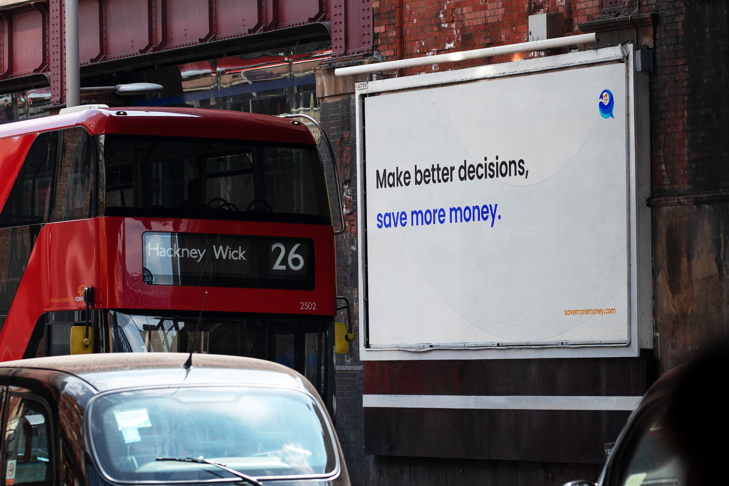
A transparent brand identity paired with a frictionless digital experience.
Een transparante merkidentiteit gekoppeld aan een soepele digitale ervaring.
01
A playful splash of blueEen speelse plons blauw
To break the monotony of traditional financial services while maintaining institutional credibility, we leaned into character-driven branding. While the Scandia typeface and core blue palette ensure a cohesive, trustworthy connection to the wider Stubben Edge Group, we complement this traditional base with vibrant orange accents, intentionally designed to draw the user's eye to critical calls to action without overwhelming them.
Om de eentonigheid van traditionele financiële diensten te doorbreken terwijl de institutionele geloofwaardigheid behouden blijft, hebben we gekozen voor branding met een karakter. Terwijl het Scandia-lettertype en het kernblauwe palet zorgen voor een samenhangende, betrouwbare verbinding met de bredere Stubben Edge Group, vullen we deze traditionele basis aan met levendige oranje accenten, bewust ontworpen om het oog van de gebruiker naar kritieke calls-to-action te trekken zonder te overweldigen.
02
Mobile primary, Jargon-Free ExperienceMobiel-eerst, jargonvrije ervaring
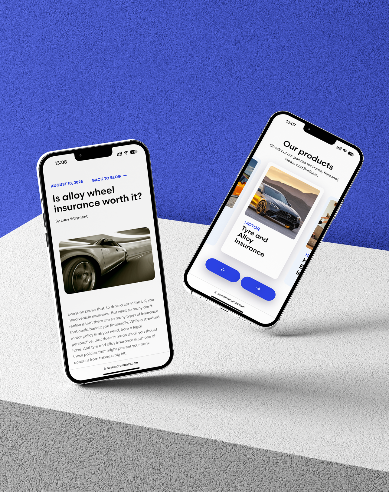
The website interface is intentionally stripped back to prevent cognitive overload. The hero section immediately greets users with our mascot and a clear, BS-free value proposition. To combat the notoriously high bounce rates of traditional insurance pages, we designed a mobile-native, highly visual flow. Further, to meet Gen Z where they are, we tested and implemented WordPress-powered "Stories" — mimicking the tap-through social media formats they already consume daily for financial advice.
De website-interface is opzettelijk sober gehouden om cognitieve overbelasting te voorkomen. De hero-sectie begroet gebruikers onmiddellijk met onze mascotte en een duidelijke 'geen-onzin' waardepropositie. Om de beruchte hoge bounce rates van traditionele verzekeringspagina's tegen te gaan, ontwierpen we een mobiele, zeer visuele flow. Om Gen Z te bereiken waar ze zich bevinden, hebben we WordPress-gestuurde "Stories" geïmplementeerd — waarbij de tik-door sociale media-formats die ze dagelijks consumeren voor financieel advies worden nagebootst.
05
The ImpactDe Impact
We successfully launched a youthful brand and a redesigned website that made financial services accessible. Product pages are completely free of jargon, empowering users to easily understand their options. The team at Stubben Edge is now committed to further iterating and expanding these service offerings into banking.
We hebben met succes een jeugdig merk en een herontworpen website gelanceerd die financiële diensten toegankelijk maakte. Productpagina's zijn volledig vrij van vaktaal, waardoor gebruikers hun opties gemakkelijk kunnen begrijpen. Het team van Stubben Edge zet zich nu in om deze diensten verder te itereren en uit te breiden naar bankieren.
≈125%
Increase in average time-on-page
Toename in gemiddelde tijd-op-pagina
−34%
Reduction in bounce rates on core product pages
Vermindering in bounce rates op kernproductpagina's
+22%
Increase in quote-form completions within six months
Toename in het voltooien van offerteformulieren binnen zes maanden
06
Reflection & LearningsReflectie & Geleerde lessen
What I LearnedWat ik heb geleerd
Handling Brand, UX, and Web Design within a fast-paced six-month timeline allowed me to maintain end-to-end ownership, moving directly from Figma to no-code to ensure our core vision survived. Ultimately, the fundamental takeaway was that Gen Z demands radical transparency, requiring every design choice to confidently answer: "Does this make the user feel safe?"
Het beheren van Brand, UX en Webdesign binnen een strak tijdsbestek van zes maanden stelde me in staat om end-to-end eigenaarschap te behouden, waarbij ik direct van Figma naar no-code bewoog om te zorgen dat onze kernvisie behouden bleef. Uiteindelijk was de fundamentele les dat Gen Z radicale transparantie eist, waarbij elke ontwerpkeuze zelfverzekerd antwoord moet geven op: "Geeft dit de gebruiker een veilig gevoel?"
What I'd Do DifferentlyWat ik anders zou doen
Moving at startup speed meant skipping early testing. Next time, I'd test brand concepts (like the whale mascot) with our Gen Z demographic before locking in the guidelines. Further, since complex jargon was the main user barrier, I'd bring the rewritten, simplified copy into the design process earlier.
Bewegen op startup-snelheid betekende dat vroege testen werden overgeslagen. De volgende keer zou ik merkconcepten (zoals de walvismascotte) testen met onze Gen Z-doelgroep voordat ik de richtlijnen vastleg. Omdat complex jargon de belangrijkste barrière was, zou ik bovendien de herschreven, vereenvoudigde kopij eerder in het ontwerpproces betrekken.